Part of the gift, or curse, of being an interior designer, is as soon as you visit someone’s house you immediately start analysing the furniture layout. And the colour scheme, and the furniture style and the fabrics. But mostly for me it’s the furniture layout. I believe that how a room is set out has the most impact on your happiness in your home. Anyone can make do with an older sofa if the space is laid out pleasingly.
Recently I visited a friend who admitted they hadn’t yet worked out how to lay out their lounge successfully. Music to my ears! Of course I was barely home before I was sketching out the room to improve the balance and functionality of the space.
Current furniture layout

Currently a dining table and chairs and three sofas occupy the space, along with a TV on a media unit. The room is lovely and wide with a window and patio door overlooking the garden, so it has heaps of potential. At this time the sofas are arranged around the outside, giving it a bit of a youth club feel. With a rejig and some zoning it will become the welcoming family space I know it can be.
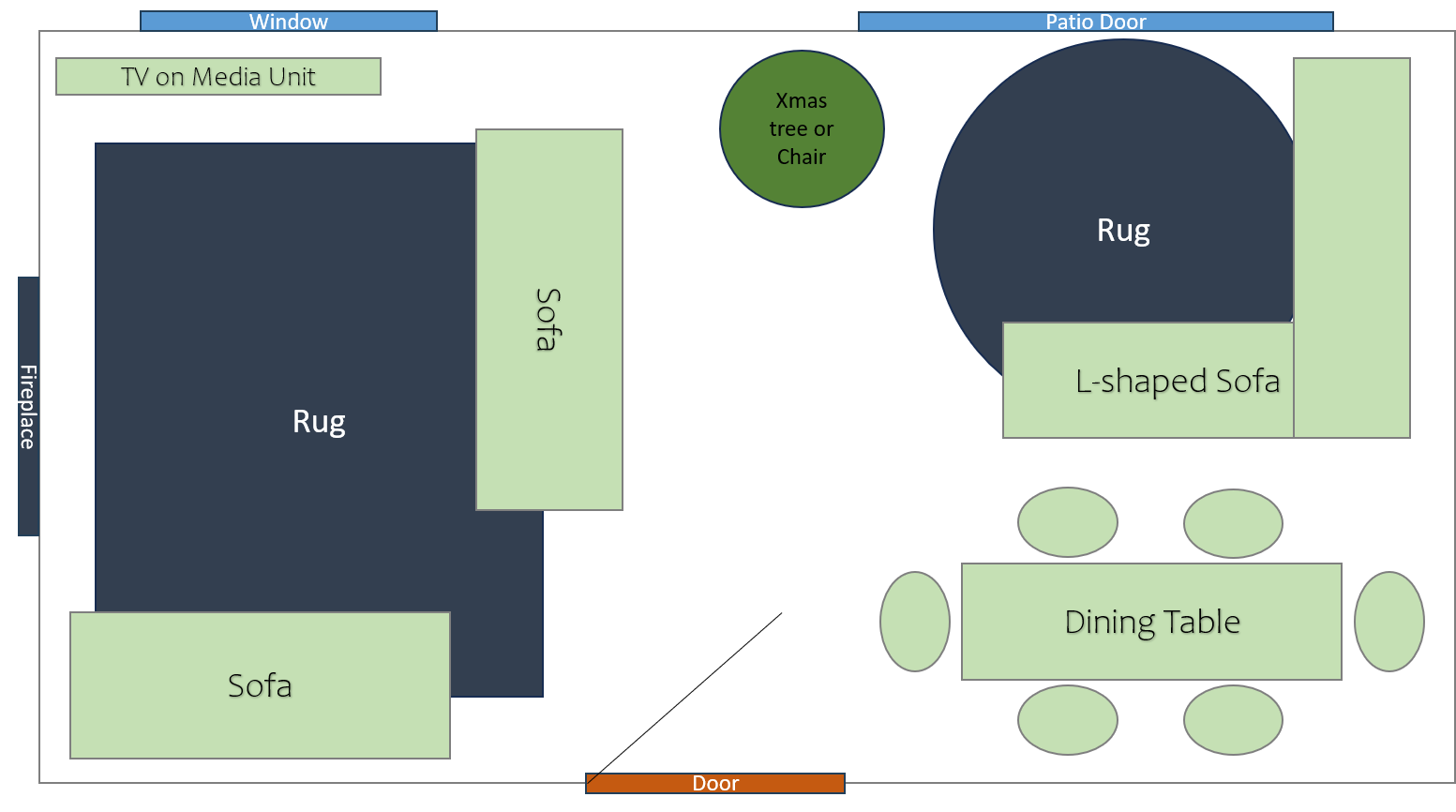
Revised furniture layout
Play the video to see how I have rearranged the space.
In my revised scheme I zone the lounge to provide three distinct areas;
- An area containing two sofas for the family of four to relax and watch TV, play on the console or gather around for a board game. The TV is now situated in the corner of the room, adjacent to the window. This is beneficial for TV watching as your eyes are drinking in the natural light and view of the garden at the same time.
- A relaxing area is created with the L-shaped sofa situated in front of the patio doors. This creates a space to enjoy a cup of tea overlooking the garden, read a book or chat with friends. Empty floor space in front of the patio doors allows you to see the full view of the garden and maximises the natural light coming in.
- The dining area is now situated at the back of the room with the table positioned by the door meaning it is closest to the kitchen. The table also benefits from being out of the glare of the sun when it’s used to work from home.
Additional Purchases
The purchases needed to pull together this look are two rugs. A rectangular rug in the TV area to ground the furniture, and a round rug under the L-shaped garden view sofa. To keep rug costs reasonable I recommend www.rugs.co.uk. Their frieze rugs are great for adding colour and comfort at good value price points.
At this time of year, it will work to place the Christmas tree at X, but in future a single chair could be placed here. Each area would also benefit from a coffee table or a stout pouf like this one from Wayfair.
If the family wanted to develop the character of the space further, I would recommend a floor to ceiling white split brick tiled fireplace in the TV area. This could have an electric fire with a mantle above to create a cosy focal point.

If you would like some help with the layout of your rooms, please get in touch for a chat. You can find our contact details here.
Final layout

