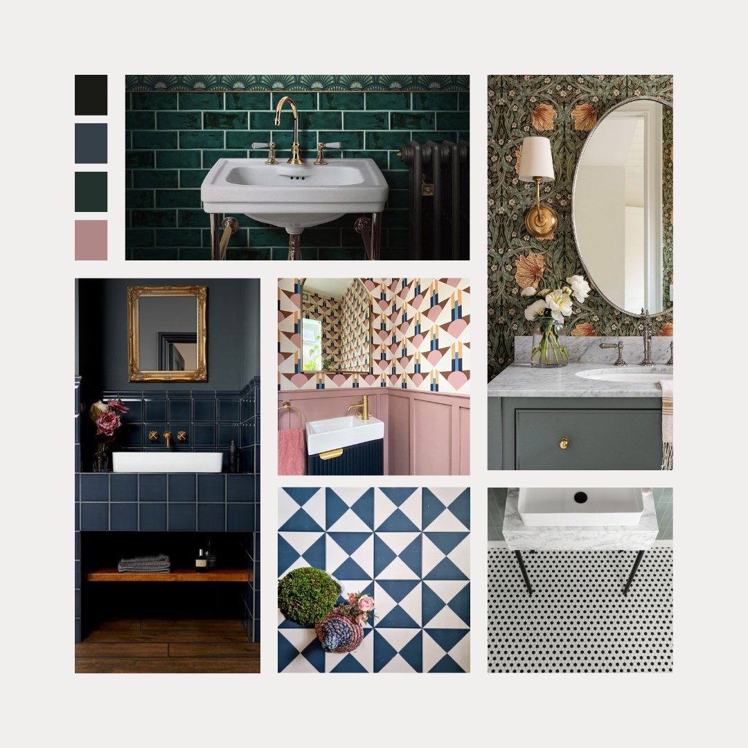
Dramatic and Striking – the Birth of Design for the Smallest Room in the Home

The downstairs toilet, the cloakroom, the powder room – whatever you call it, it’s undoubtedly the smallest room in your home. It’s never been given much attention, it’s functional and that’s about it. But things are changing for the humble loo. Read on for our top design tips to transform this room.

Using Colour
A successful colour palette for your downstairs loo that few might expect is dark – darkest dark! This is a room that you can paint black. And if you stick with traditional white sanitaryware and play with black and white patterns on the floor your downstairs loo will become a monochrome heaven.
If you can’t bring yourself to reach for the tin of black in the paint aisle, how about navy blue. Hicks Blue by Little Greene is a favourite and the depth of colour you can achieve with this on the walls is lush. Pick a floor tile with blue accents to provide contrast, or pair with mid or light-toned wood for a Scandi effect. This looks smart-as with white sanitaryware. Equally lush, and more aristocratic-looking is dark green. This colour has country house vibes and looks good with brass taps.

If you want to create something that nails the latest trends, and to be honest this is always going to look good, a great design tip for your toilet is to paint your woodwork. Not in white though! Door frames and skirting boards are crying out for your attention. Give them some love to tie the whole room together. Either colour-wash them in the same colour as the walls, or paint them in a contrasting shade for an impactful design.

Using Pattern
Perhaps a bold colour was enough – but perhaps you want more, more, more! Now you’re on this design train the next stop is wallpaper. If you like a more traditional feel the patterns of William Morris are back in vogue. Other decorating giants Sanderson and Harlequin have also got some gorgeous patterns to choose from. Pop down to your local Brewers to leaf through the books, or use www.wallpaperdirect.com which allows you to search by colour to help narrow things down.
Also consider a theme for your paper to reflect your own loves and passions. I really miss my Quentin Blake Cockatoos which I left behind at my last house – complete with green vinyl floor from The Colour Flooring Company. This time I’m going to use the ‘Under the Sea’ wallpaper by Caselio. This will transform my son’s cloakroom into an underwater haven, complete with dark blue woodwork.
This Time in Colour on IG and Tik Tok is masterful at this much-admired duet of decorating – wallpaper plus painted woodwork. She exemplifies picking a theme and being brave!

Choosing the Fixtures
A white toilet and sink works well with a dark colour scheme in a downstairs loo, so you don’t need to go the extra mile with your sanitaryware. But…if you want to there are some very swoon-worthy basins on the market right now. Coloured concrete from Claybrook or marble options will show this little room just how much you care. Also, don’t forget to consider wood accents. If you’ve got Luxury Vinyl Tile or laminate on the floor, you could match this to your vanity unit for cohesion. A wood-effect vanity also has the benefit of adding textural interest to the room.
Remember to make time to choose taps that work in your scheme. Matte black looks super smart with any dark colour, but brass also works with dark green. I recommend Coalbrook for high-quality, modern, tasteful designs.

Getting the Accessories Right
If you’ve come this far I don’t expect you’re going to give up now and let the details get away from you. The surround of the mirror, the towel ring or rail, the loo roll holder and the towels themselves all need to work with your new punchy colour scheme. If you’ve gone for black, stick to monochrome with black or white towels. If you’ve got wallpaper pick up a colour from the pattern. And if you’ve colour-washed the room, either stick to that colour or bring it one shade lighter or darker with the hand towel.
Every time you open the door to this room you’re going to be glad you did this. It’s a small room, it won’t cost much to do and you can close the door on it most of the day. But perhaps you’ll end up spending more time in there than usual. Perhaps you’ll start thinking about how to transform the other rooms in your home. It just might be the start of your home design journey.
If you’d like to discuss a cloakroom rennovation after reading these design tips, please get in touch today using the details on my Contact page.
Credits from the top
KarrBick.com black powder room renovation.
Green bathroom by Divine Savages, black and white mosaic tiles from Topps Tiles, Capsule blue bathroom tiles from Walls and Floors, Harlequin blue and white geometric tiles from Your Tiles.
Blue door and woodwork by Ashe Leandro.
Pimpernel Morris wallpaper used by Studio McGee, Sanderson wallpaper used by Inside Number_10, Art Deco paper used by This Time in Colour, Pierre Fray‘s ‘Mojito’ wallpaper used by TodHunterEarle.com.
Concrete sinks by Claybrook.
Dark bathroom by Coalbrook.
